


Introduction
Recently while working on a personal project using Flutter, I got the need of having a progress indicator that would show the percent completion of a task by the user. I was initially using percent_indicator but later realized that I was just using a small part of the package and the rest was just useless.
So I thought about how to create one myself and it was utterly simple. Here's how to do it. You just need to have some basic idea about stateful and stateless widgets in Flutter. Refer here.
Implementation
Getting Started
I generally do experimental stuff and play around with widgets on a separate project. You can set up a new project or continue in an existing one too.
flutter create your_app_name
Once it is created, run code your_app_name to open the project in VSCode.
Idea
I wanted to have something like this:
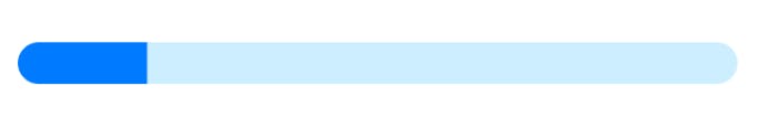
The light part shows the total width of the progress bar while the dark blue part, which indicates the progress, would start from 0 and animate slowly to take up its required width to show the progress when the widget first loads.
PercentProgressIndicator
Create a stateful widget. I named it PercentProgressIndicator. It returns a Stack with two children - the complete bottom bar and the top progress indicator. These are two containers wherein the second one (for the progress) is an AnimatedContainer so the width can be animated.
The widget contains a single state value - width as we need to change the widget based on its width. The widget gets a percent field in the constructor that shows the progress. Width is calculated based on the percent. To animate the container, the initial width is set to 0 and in the initState function, it is updated to the desired width after some time (say 500 milliseconds) so that animation effect can be shown.
Code
percent_progress_indicator.dart
class PercentProgressIndicator extends StatefulWidget {
  final double percent;
  final Color backgroundColor;
  final Color progressColor;
  final double height;
  final double width;
  final double borderRadius;

  const PercentProgressIndicator({
    super.key,
    required this.percent,
    this.backgroundColor = Colors.grey,
    this.progressColor = Colors.blueAccent,
    this.height = 10,
    this.width = 300,
    this.borderRadius = 12,
  });

  @override
  State<PercentProgressIndicator> createState() =>
      _PercentProgressIndicatorState();
}

class _PercentProgressIndicatorState extends State<PercentProgressIndicator> {
  double _width = 0;

  @override
  void initState() {
    super.initState();
    Future.delayed(const Duration(milliseconds: 500), () {
      setState(() {
        _width = widget.percent * widget.width;
      });
    });
  }

  @override
  Widget build(BuildContext context) {
    return Stack(
      children: [
        Container(
          width: 300,
          height: 10,
          decoration: BoxDecoration(
              borderRadius: BorderRadius.circular(widget.borderRadius),
              color: widget.backgroundColor),
        ),
        AnimatedContainer(
            duration: const Duration(milliseconds: 800),
            width: _width,
            height: widget.height,
            decoration: BoxDecoration(
                borderRadius: BorderRadius.circular(widget.borderRadius),
                color: widget.progressColor)),
      ],
    );
  }
}
main.dart
void main() {
  runApp(const MyApp());
}

class MyApp extends StatelessWidget {
  const MyApp({super.key});

  @override
  Widget build(BuildContext context) {
    return MaterialApp(
      title: 'Flutter Demo',
      theme: ThemeData(
        primarySwatch: Colors.blue,
      ),
      home: const HomeScreen(),
    );
  }
}

class HomeScreen extends StatelessWidget {
  const HomeScreen({super.key});

  @override
  Widget build(BuildContext context) {
    return Scaffold(
      appBar: AppBar(
        title: const Text('Percent Progress Indicator'),
      ),
      body: const Padding(
          padding: EdgeInsets.all(8.0),
          child: Center(
              child: PercentProgressIndicator(
            percent: 0.8,
          ))),
    );
  }
}
You can put in more modifiable fields in the percent_progress_indicator to make the widget completely customizable based on the needs.
This is a fairly simple implementation and a lot better than using some external package for basic use.
How it looks
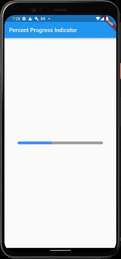
That's it. You have yourself a progress indicator that you can use in your next app.
If you liked the article, you can follow me on Twitter and LinkedIn to get more tech and development-related tips and updates.